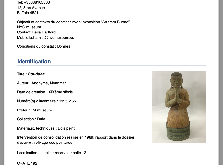
New layout “Exhibition”
We now offer a second layout option, available via the Preferences menu (top left of the home page) > Profile > Document Layout.
This new format differs from the Standard layout in several ways:
-
Photographs and observation reports are grouped at the end of the document.
-
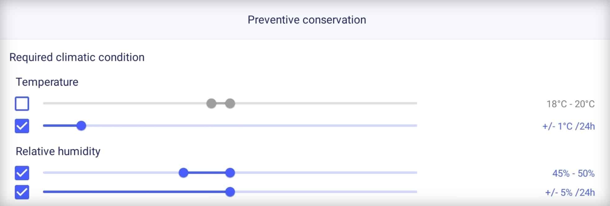
The first two pages gather all textual information: legal details, artwork identification, final remarks, preventive conservation, and packing information.
-
The document title highlights the date and location of the condition report.
-
At the top right of the first page, key information is displayed in red and bold: this indicates any specific precautions (special attention, alarm system, dusting authorization, lender’s condition report consultation).
This layout was developed in collaboration with exhibition management and production teams. We hope it will best meet your needs in that context.
You can compare the two layouts by downloading these two examples: standard layout/exhibition layout.
iOS release date: March 2025 – Android release date: April 2025



Recent Comments